
Steampunk wallpaper can mean two different things. One is paper for the walls of a room, patterned with gears, maps, leaves or damask. The other is a picture on the screen of a phone or a computer: a steampunk background of brass, cogs and old paper behind the icons. Both draw on the same Victorian sources, and both often carry lettering, which is where the steampunk font comes in.
This guide covers all three. It explains what makes a steampunk background, the patterns and colours of real wallpaper for walls, how to choose a background for a phone or a computer, which kinds of lettering look Victorian and where they came from, how to use fonts and pictures within copyright, and how to make your own designs. It names no shops or websites to get anything from.
What makes a steampunk background
The colours
A steampunk background starts with warm, deep colours: brass and copper, the brown of leather and old wood, the cream and tea colour of aged paper, soot black, and a little deep red, bottle green or navy. Our guide to the steampunk aesthetic explains why those colours belong to the style. Bright, cold colours, pure white and neon read as modern, so they are best kept for small details or left out.
The textures
Texture does as much work as pattern. Old paper with stains and foxing, worn leather, riveted metal sheet, brickwork, dark wood grain and pressed tin all say steampunk before a single gear appears. A plain background of aged paper or dark leather is often more useful than a busy one, because it sits behind whatever is placed on it.
The motifs
The motifs are the familiar ones: gears and cogs, pipes and valves, gauges, clock faces, maps and compasses, engineering drawings and blueprints, airships, keys and the ornate frames of Victorian printing. Our guide to steampunk art and artists explains where those images came from.
A background stays in the background
The test of any background, on a wall or a screen, is whether it lets other things stand in front of it. A wall is a setting for furniture, pictures and lamps; a phone background is a setting for icons and the clock. Keep the strongest detail away from where things will sit, and keep enough contrast that anything placed on top can still be seen.
Wallpaper for walls: patterns and colours
The Victorian passion for wallpaper
The Victorians papered their rooms more than anyone before them. Until the late 1830s, all wallpaper was printed by hand from carved wooden blocks. In 1839 the first wallpaper printing machine was patented, by Potters & Ross of Darwen in Lancashire, and the V&A records that Britain's output rose from about one million rolls in 1834 to nearly nine million in 1860, with the cheapest papers falling to a farthing a yard. Within a generation, wallpaper had become something almost every household could afford.
Damask
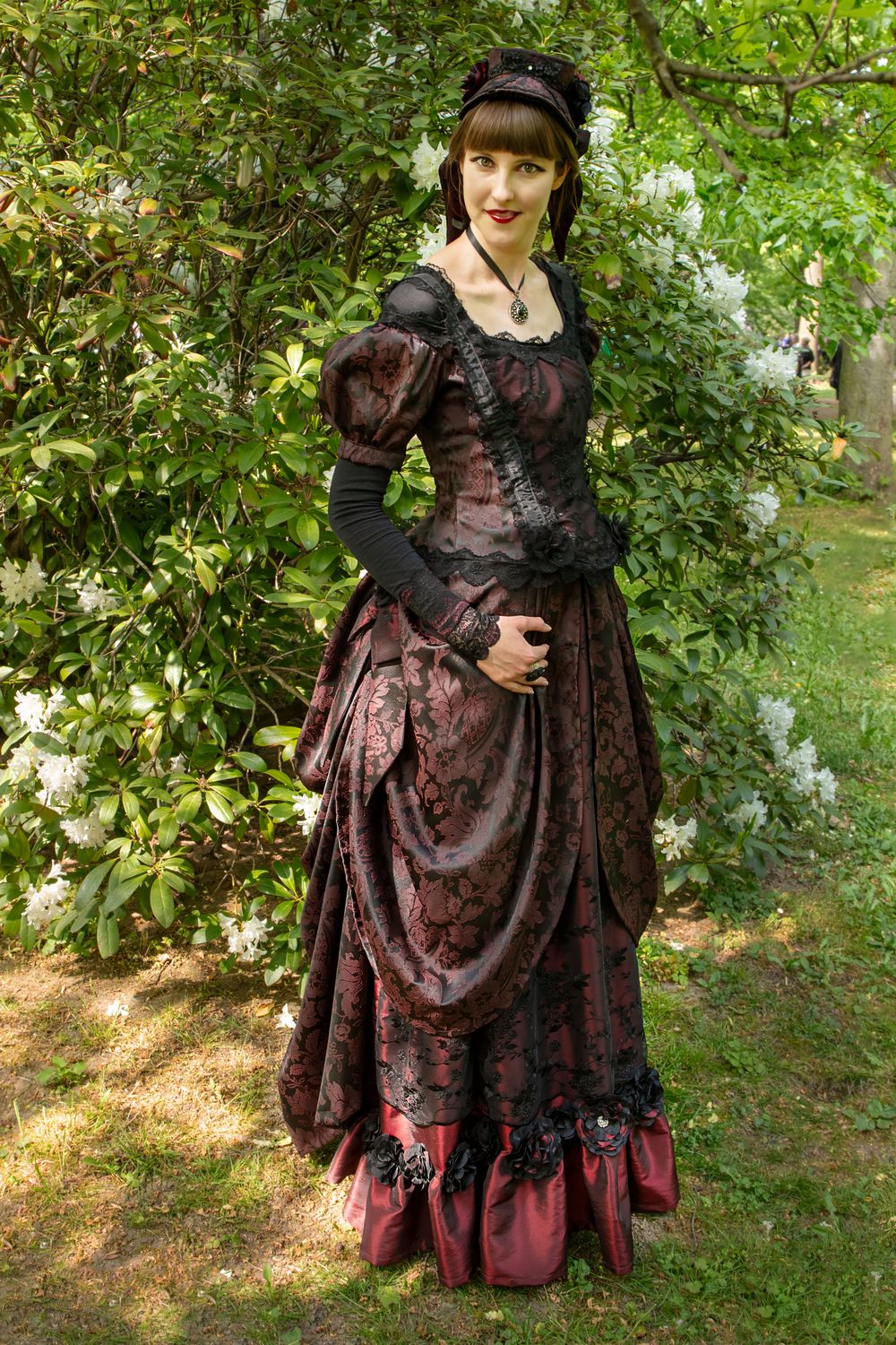
Damask is a woven, reversible fabric whose pattern shows through a change in the weave, usually of flowers, fruit and leaves; it is named after Damascus, a great trading city on the Silk Road. Wallpapers have long copied it, and by the 1730s paper imitations of damask and velvet were common. A damask pattern in deep red, green or brown, with a slightly darker pattern on a ground of the same colour, is one of the most reliable choices for a steampunk room: it is unmistakably Victorian and quiet enough to live with.
Flock
Flock wallpaper was invented to imitate costly cut-velvet hangings. Powdered wool, a waste product of the cloth trade, was scattered over a pattern printed in glue, where it stuck and stood up like the pile of velvet. In the nineteenth century, flocks were stamped for an embossed finish, and designers including A. W. N. Pugin and Owen Jones made them, though later Victorian critics thought them dark and unhygienic. A deep red or green flock is the paper of a Victorian gentlemen's club or a grand hotel.
William Morris
The most famous wallpaper designer of the age went another way. In the 1860s, fashionable papers were covered in lifelike, showy flowers and tricks of the eye. William Morris drew instead on the simple plants of British gardens, fields and hedgerows. His first design, Trellis, inspired by the rose trellis at Red House in Kent, was designed in 1862, and Daisy of 1864 and Fruit of 1865 followed; Willow came in 1874 and Willow Bough in the 1880s. He made more than fifty wallpapers in all, nearly all of them printed by hand from woodblocks with natural, mineral-based colours. A Morris pattern of leaves and birds in deep greens, browns and golds sits beautifully behind brass and dark wood.
Embossed papers
The Victorians also loved walls with relief. In 1877 Frederick Walton, who had patented linoleum in 1860, launched a deeply embossed wallcovering made from a paste of linseed oil pressed into a pattern on a paper backing; it was used from royal homes to railway carriages. Painted in dark brown or old gold and rubbed back, an embossed paper looks like tooled leather or pressed metal, which suits a steampunk room very well.
Gears, maps and drawings
Modern steampunk wallpapers add the motifs of the style: gears and cogs, old maps, engineering drawings, airships, or plain papers printed to look like aged leather, riveted sheet metal or brick. They are strong patterns, and one wall is usually enough; a whole room papered in gears can feel like living inside a clock. Our guide to decorating a room in steampunk style explains how the Victorians divided a wall into three bands, and has a warning about the poisonous pigments in some old papers.
Colours for walls
For the walls themselves, deep colours work best: bottle green, oxblood red, navy, chocolate brown and charcoal, with brass, wood and leather in front of them. Pale walls can work too, in cream or the colour of old paper, if the furniture and fittings bring the darker tones. Our guide to Victorian architecture and interiors shows how real Victorian rooms used colour.
Backgrounds for phones and computers
Choosing a picture
A good steampunk background for a screen follows the same rule as a wall: it is a setting, not the main event. On a phone, the icons sit in a grid over most of the screen, and the lock screen puts the time near the top, so a picture with a strong subject near the bottom or the middle, and quiet texture elsewhere, works better than one that is busy all over. On a computer, the icons usually sit at one side, and windows cover most of the picture most of the time.
Light and dark
A dark background, of black, deep brown or dark metal, makes light icons and text easy to read and is easier on the eyes at night. A light background of old paper needs dark text and icons to stand out against it. Whichever you choose, check that you can still read everything on top of it at a glance.
Shape and size
A phone screen is tall and narrow and a computer screen is wide, so a picture that suits one rarely suits the other without being cropped. Each device asks for a picture of a particular shape and size, and the exact numbers change from model to model, so look in the device's own settings or its maker's help pages before making or choosing one. A picture smaller than the screen will look blurred when it is stretched to fit.
Pictures you are allowed to use
The safest background of all is a photograph you took yourself: a clock in a museum, the gears of an old engine, a brick wall with pipes, an old map on a table. Some museums publish pictures of their collections for people to reuse. The Science Museum Group, for example, makes its collection images available under a Creative Commons licence where it can, and its online collection lets you search for pictures released for non-commercial use; anyone wanting to use them commercially is asked to contact its picture library. Read the licence on each picture before you use it. The next section but one explains why that matters.
Fonts that look Victorian
A typeface is the design of a set of letters; a font is, in everyday use, the file on a computer that lets you type in it. The lettering that looks most steampunk comes from the nineteenth century, when printers began to make letters for posters and advertising as well as for books.
Didones: the modern face
Didone typefaces have strong contrast between thick and thin strokes, very thin flat serifs (the small strokes at the ends of letters), and upright, vertical stress. The name was coined in 1954, from the surnames of Firmin Didot and Giambattista Bodoni, whose work defined the style around 1800; in its own time it was called the modern face. It was the standard style for general printing in the nineteenth century, which is why it looks so Victorian on a page.
Fat faces
A fat face is a Didone pushed to an extreme, with very heavy thick strokes and thin ones kept hairline. Fat faces appeared in London around 1805 to 1810, made to shout from posters and advertisements, especially for lotteries, and they were used for signs and lettering on buildings too.
Slab serifs: Egyptian and Antique
Slab serifs have thick, square serifs and fairly even strokes. The first known slab-serif lettering is on a London lottery advertisement of 1810, and the London typefounder Vincent Figgins probably issued the first slab-serif type, which he called Antique, around 1815 to 1817. They were also called Egyptian, a name that seems to have ridden on the fashion for all things Egyptian after Napoleon's campaign there, though they have nothing to do with Egyptian writing. Printers of the day thought them fit only for posters and placards, which is exactly where they made their name.
Clarendon
Clarendon, registered in 1845 by Robert Besley of the Fann Street Foundry in London under the Ornamental Designs Act 1842, is a slab serif with curved, bracketed serifs and some contrast. It was made as a bold companion to ordinary text, to give stronger emphasis than italics, and its descendants still look like a Victorian handbill.
Wood type
Very large letters for posters were often cut from wood, which was lighter and cheaper than large metal type. Darius Wells published his first known catalogue of wood type in New York in 1828, and William Leavenworth introduced a pantograph for cutting it in 1834. In Britain, DeLittle of York was a long-running maker. Bold, condensed wood-type letters, with decorated serifs and ornaments between the lines, are the look of a Wild West poster and of many steampunk title cards.
Copperplate script
Copperplate is a flowing handwriting script, based on English roundhand, whose name comes from the copybooks printed from engraved copper plates that taught it. George Bickham's The Universal Penman, published from 1733 to 1741, gathered samples from twenty-five London writing masters. It is the script of Victorian invitations, certificates and labels, and it suits a name or a single line rather than a paragraph.
Typefaces made today in these styles
Many modern typefaces revive these styles, and some are published free under an open licence, with their history and licence on record:
- Abril Fatface, by TypeTogether (Veronika Burian and José Scaglione), is a fat face inspired by the heavy poster lettering of nineteenth-century Britain and France.
- Playfair Display, led by Claus Eggers Sørensen, is a high-contrast display face first published in 2011, drawing on John Baskerville and the Scotch Roman designs.
- Old Standard, by Alexey Kryukov, reproduces the modern face that was common in books of the late nineteenth and early twentieth centuries.
- Rye, by Nicole Fally, and Sancreek, by Vernon Adams, are both inspired by nineteenth-century wooden poster type.
- Pinyon Script, by Nicole Fally, is a round hand script in the copperplate manner.
All six are published under the SIL Open Font License, which the next section explains. Use one decorative face for headings and a plain, readable one for anything longer than a line; a page set entirely in a fat face or a script is very hard to read.
Using fonts and pictures within copyright
Pictures are someone's copyright
In the UK, copyright protects original artistic works, including drawings, paintings and photographs, automatically: nobody has to apply or pay. Without the owner's permission, nobody else may copy the work, hand out copies, show it in public, adapt it or put it on the internet, and for an artistic work copyright lasts until 70 years after the artist's death. The Intellectual Property Office, the government office responsible for copyright, says that the vast majority of images on the internet are likely to be protected, and that copying images and hosting them on another website will usually be an infringement. So a steampunk background found in a search is not free to copy, print on a mug or sell, however easy it is to save.
Old engravings and maps
Victorian engravings, maps and engineering drawings are a rich source for backgrounds, and most of their makers died long ago, so the copyright in the pictures themselves has usually run out. The Intellectual Property Office's view is that simply making a copy of an image does not create a new copyright, so a faithful scan of an old print is unlikely to have one. A modern book that reproduces old pictures can still have rights of its own, though: the layout of a published edition is protected for 25 years from first publication, and any new text, colouring or photography in it belongs to someone.
Fonts carry a licence
A typeface and a font file are treated differently. Under section 54 of the Copyright, Designs and Patents Act 1988, using a typeface in the ordinary course of typing, typesetting or printing does not infringe the copyright in the design of the typeface. But a font file is software, and it comes with a licence that says what you may do with it. A free download is still licensed: free means you did not pay, not that there are no conditions. Some free fonts may be used only in particular ways or places, so read the licence that comes with every font before you use it in anything you share or sell.
The SIL Open Font License
The SIL Open Font License, used by many free typefaces including the six above, is generous. It says the fonts can be used in books, posters, artwork, logos and on websites, with no acknowledgement required, and they can be changed and passed on. It has conditions, though. The font software may not be sold by itself; every copy must carry the copyright notice and the licence; and a changed version may not use the font's reserved name without the copyright holder's written permission.
Museum pictures and other licences
Pictures shared under a Creative Commons licence come with conditions too, such as crediting the source or using them only for non-commercial purposes. Follow the conditions exactly, and ask the owner if you want to do something the licence does not cover.
Making your own designs
Start with your own photographs
The easiest way to have a steampunk background that is entirely yours is to make it. Photograph textures whenever you see them: brickwork, rusted iron, old leather, the grain of a wooden table, the face of a clock, the wheels of a locomotive, a map in a drawer. Shoot them flat on and in even light, and you have a library of textures to build with.
Layer it
Most good backgrounds are built in three layers. First a texture, such as old paper or dark leather, over the whole area. Then a motif, such as a gear, a gauge or an airship, placed where it will not be covered. Then, if you want it, a line of lettering in a Victorian typeface. Keep the texture quiet and let the motif carry the picture.
Draw the gears yourself
Drawn gears look better than copied ones, because you can make them mesh. Our guide to how to draw steampunk shows how to draw gears, pipes and gauges step by step, and our guide to cogs, gears and machines explains how real gears fit together. A scanned pencil drawing coloured in browns and golds makes a fine background.
A pattern for a wall
For a wall, a design can be cut as a stencil and painted, or used as a frieze, a band of pattern just below the ceiling, with a plain colour beneath. A repeating pattern has to join seamlessly at its edges, so draw one tile and check that it lines up with copies of itself on every side before you cut anything. A single stencilled gear, a line of rivets or a painted map on one wall can be enough.
Lettering of your own
Victorian signwriters and engravers drew their own letters, and you can too. A name or a motto drawn in the manner of a fat face or a copperplate script, with a ruled frame and a flourish at each corner, makes a background that nobody else has.
Keep it readable
Whatever you make, look at it from a distance and on the device it is for. If the icons vanish, the lettering cannot be read or the wall feels crowded, take something away. In steampunk, as in Victorian design, the best pieces are rich but never muddled.